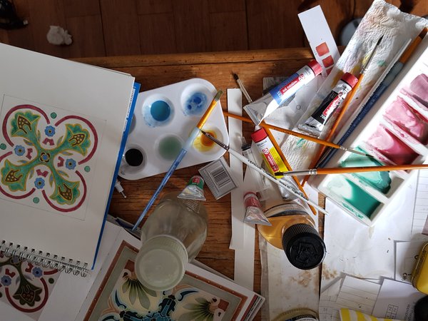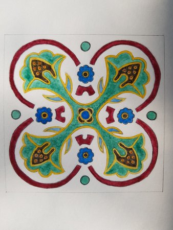
There are some great designs in the V&A book (‘The Tile Book’ : see previous example for example) and I decided to do another one. As the title suggests, it is quite colourful, as you can see from the number of brushes I used:

Maybe a few too many, really.
Yes I used some to try and give it a glossy effect. Worked quite well on the red parts.

Despite some effort, it is a little bit asymmetric in parts. However, I’m pretty happy with the result. Except the green could be darker. Still, quite happy. Mostly.
This one I certainly put on Etsy here.