Yes, I bought some fluorescent inks and combined that with the ‘Summer of Truchet Tiles’ (see previous post for details). I wanted to try the same varying colours, with varnish layers on a larger scale.
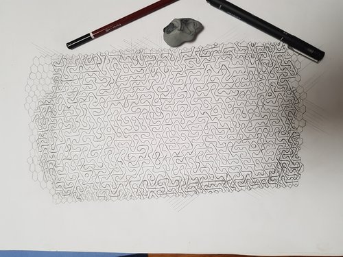
To start, I drew out the geometry. As you can see here, for some reason I decided to freehand the underlying hexagons. Not clear why, but I suppose it gives a more organic look:
This photo is actually at the satisfying point where I’ve inked the pencil lines, and am now erasing the pncil with a kneadable eraser.
Yes, using red and yellow ink with varying shades to try and introduce more, well, variation. As often happens, it looks quite good at this point
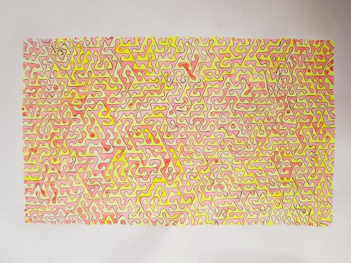
However, the plan was to have even more colours and variation, so - onwards!
Hmmm. So after a lot of varnish then colour, then varnish, then removing colour and varnish, and general fiddling about:
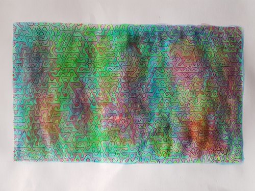
I mean. It looks ok. The large patches of different colours are nice, but maybe the variation should be more distributed. Oh, and I did not mention that it is indeed very bright. Fluorescent, even (not to be confused with phosphorescence of course - see this for details if you like).
After giving up on making it any better, I gave it a final varnish
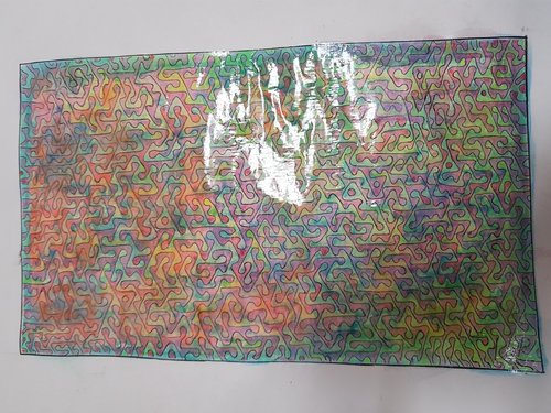
I’m not totally unhappy with the result, but not quite what I had in mind, which was a subtly varying multicoloured coral pattern that looked underwater. Still, it has some of these elements.