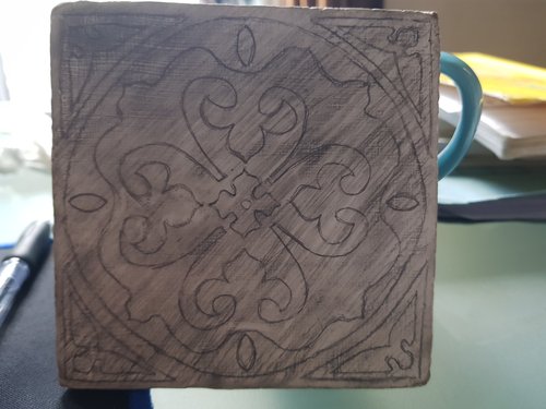
Whatever. The tile design that I originally reproduced on paper - see here - and it seemed an obvious next candidate for one of my 10x10 cm gesso ‘tiles’. Given the difficulties of transferring a pencil design onto gesso, I decided to make the underlying geometry a bit messy like so:

The idea of the ‘shading’ here is to make the final result more grainy and potenitally more interesting.
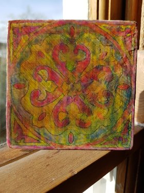
So the ‘circus’ label was due to the red/yellow/blue colours (same as the first time I did this) ended up looking a little strange. After a lot of fiddling about with (for example) layers of a single colour (with medium) on top after the initial colours.

It has an interesting look, like a faded poster for a circus. I guess.