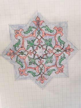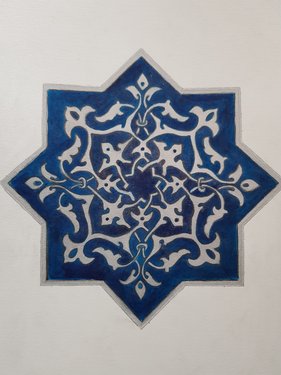
Yes, I saw this on Pinterest (for once, coming in useful) and copied the design and palette completely. I really like the contrast in the original between the deep blue and the silver. The outline of the shape was relatively easy to recreate, using the double-trace and rotate segment trace techniques:

Here I’ve coloured the components separately, to make them clearer. Getting some of the curves and the thin sections correct was a challenge.
Painting with ink was a little fiddly, as getting the blue even all over was hard. In retrospect I could have painted overall of it, then put the silver on top. That might have been a little tricky with the pencil lines, so maybe not the best plan:

The other major flaw/mistake here was putting the varnish on. Despite haveing done much the same with the blue-brown butterfly a few weeks earlier, I failed to test whether silver ink (which has metallic flakes in) would dissolve in the varnish.
Turns out it does, and the silver particles came off! Sigh. If done again, I would make either spray varnish or paint along the flow of the silver not across it, before filling in the gaps with more varnish.