I reserve the right to not answer that question. Anyway, I took a photo of the river that was a weird two colours : a sort of green/orange on top and a kind of purple/green on the bottom (in the shade of the trees). So I wanted to replicate this. I started out with extremely horiontal wavy layers of gesso as a base:

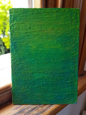
This picture is after multiple layers of matt varnish and acrylic. However it just ended up as quite green with some blue. Not quite what I wanted.
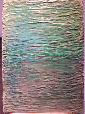
The actual wavy gesso does come through reasonably well, but I think that thinner layers of colour might have looked better. This is the same (or later?) from a different angle with a different light:

Also, I tried using white and black inks to change the look. The actual waters are quite muddy, so a grey mix of watercolour inks might have worked. It wasn’t that effective.
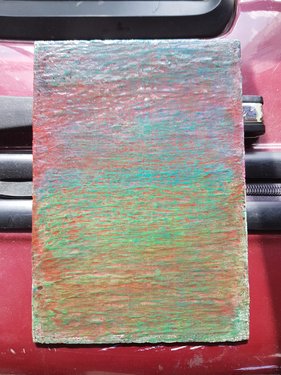
Ho ho. With some red on top, the green looks quite good. Then finally the usual silicone oil and varnish made it look somewhat better.

In the end, I’m a lot mre pleased with it even though it never really looked like the colours of the photo that I originally made :)