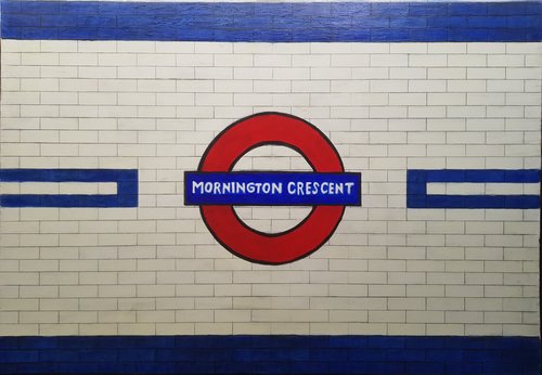
Alright! Yes the last bits took aaaaages. Mainly it was getting the text right and the colour of the blue tiles and the roundness of the sign. Here it is :

Am I totally happy with it? No, I never am, but pretty happy with the cream (and blue) tiles and the lettering is a lot better than it was. However I was making the circular parts of the sign worse as I tried to adjust them, the blue around the letters is slightly off, and I regret the black layer on the tiles.
Overall, I’m glad it’s done, and I do like it a lot but I’ve learned some things not to do …