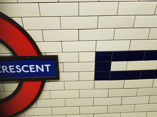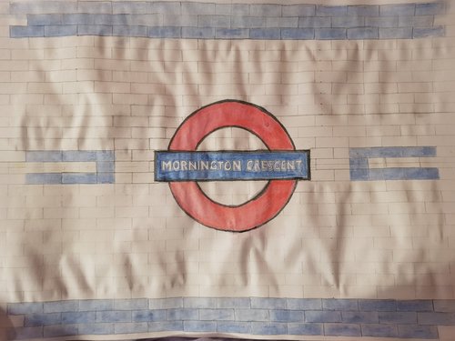
No, I am aware that there was an absurdist radio game revolving arund getting to Mornington Crescent. It’s fine; I have no real opinion on it either way. No I am talking about the actual station, that I use in the mornings. I had a fancy to paint the sign along with a section of the wall, as I like the blue and cream tiles.

Here is what it looks like (detail). Hilariously the reference images I used online occasionally have many watermarks - like, my dude, this is a standard photo of a publicly available sign … does it really need a watermark?
To get the scale right, I made a couple of sketches on A3 paper. This was useful, as the first one I did was slightly too large scale. The sign was nice and large, but the detail of the tiles would not have been quite right (the ratio of blue to cream tiles, and the geometry of the tiles around the edges of the sign).

This scale is slightly better, although the lettering may turn out to be tricky. It also makes the sign look quite small … butttt maybe that’s ok?
Of course, I have a carfully polished A3 gesso board that I’ve been preparing for several weeks now lol.