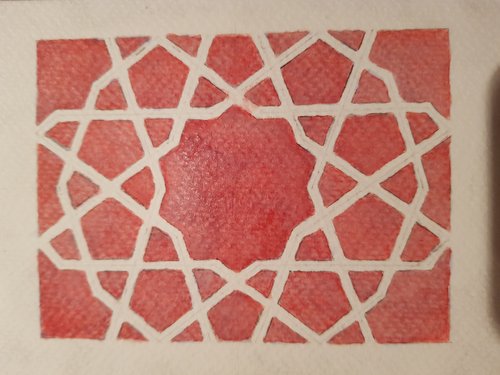
Yes, likely the last in this current series. It did not work quite the way I hoped it would. I was going for the deep blue that you get in London Underground tiles so I though a base of red ink like so:

Which was nice and uniform, so avoiding the problem of readability in the purple one (a few posts ago).
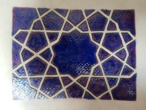
Then the blue layer, again in a nice unifom way, right? Sadly it did not work so well:

The gloss paint did not dry uniformly on the varnish layer over the ink. Partly this was how dilute it was (possibly?) or the exact amount of gloss, and partly due to my impatience in not letting it dry (?). I also wonder if the first varnish layer should not have been left to dry? Oh whatever.
The overall effect is not terrible I suppose, it’s just not quite what I had in mind.