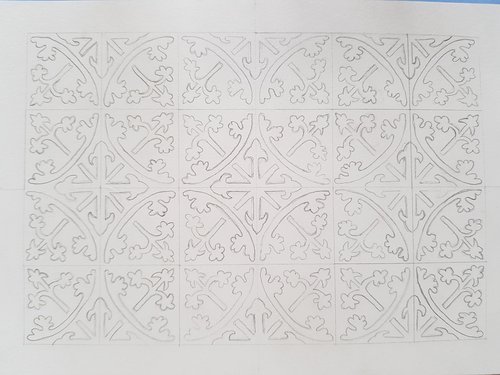
I wanted to reproduce the effect of ‘faded’ or worn tiles from a picture in Hans van Lemmen’s book ‘Medieval Tiles’ of a floor from the 12th Century Rievaulx Abbey in North Yorkshire. The basic pattern is circular and leafy:

A little bit asymmetric due to errors in my tracing, but otherwise looks ok.
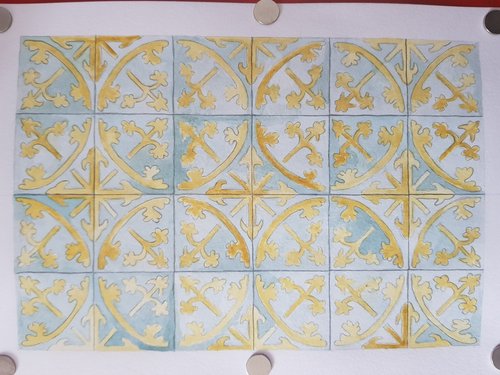
The main idea was to paint in a very uneven way. I tried blobbing masking fluid in patches at first, which certainly helped. However I reckon that unless I really wanted patches of bare paper (I did not) this was not really worth it. Here is what it lloked like at this point:

Pretty good, but not quite right.
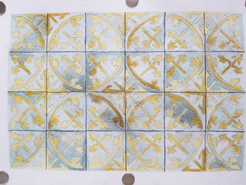
On top of the uneven painting - including some gum arabic for the darkest parts - I then varnished these ‘unworn’ (as it were) parts. Then I grated some graphite pencil over the top with sandpaper and rubbed it over with my finger :)

This … sort of works. The graphite pencil between tiles was maybe too much, and I did end up lifting some of the graphite off again with kneadable eraser. Overall it was fun, and I’m pleased but there could be improvements to this method.
The final item is here