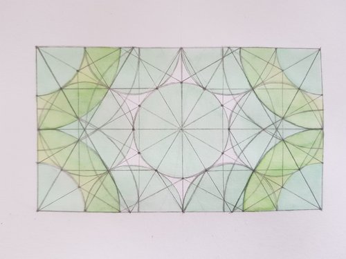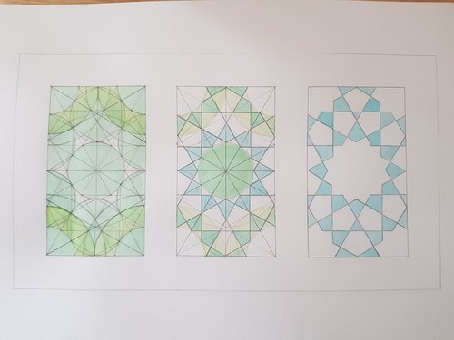
One problem with the pencil ‘triptych’ (I know that’s the wrong word, still) is that there is a lot of noise in there. To put it another way, it is not obvious how the flow of the construction step go from one diagram to the next. To get around this, I tried adding colour:

The intention here is to have multiple colour layers (but not too many?) to emphasize the important shapes used to construct the later diagrams.
The result is this:

The nice thing about this layered approach is the mixing of colours - the blue final shapes layered over the green circles in the middle part become a blue-green. That might or might not be what is wanted, but it looks good.
Of course, these images are still fairly incomprehensible unless you construct these kinds of diagrams! A better way of doing this might be the approach of making a tiling, with the construction occuring gradually across the plane.
The final thing is available here