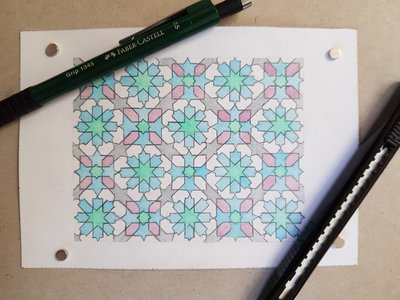
I made a smaller copy (on A6) of the one I did on A4. I should really find out a name for this design, such as where it was used or similar.
The geometry came out pretty well, although it is perhaps a little small to be truly accurate.

For example, there is some variation in size in the larger elements, and the crossovers are not always quite right. Perhaps I’m being too picky.
The colour scheme was much nicer, I thought. Leaving some parts unpainted also helps, as it makes the pattern clearer. Also, the grey shapes connecting the central squares give some background to the other colours.
Finally, using gouache makes the colours a lot clearer, with less applications, and more even.
The finished article is here on Etsy.